“The Website is a Living, Breathing Thing…”


It still doesn’t seem quite real.
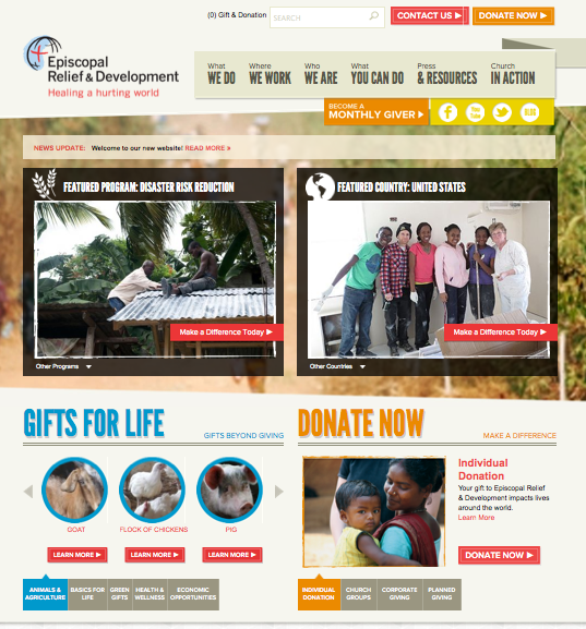
Some of you who’ve launched new websites can probably relate. Episcopal Relief & Development’s new site – www.episcopalrelief.org – finally went live last week. The journey to this point was somewhat longer and more … educational than we’d foreseen. But judging from the enthusiastic responses we’ve gotten, the end product was worth the wait.
When we (Malaika Kamunanwire, Senior Director of Marketing and Communications and my project co-manager, and I) launched the project in fall 2011, it had been several years since the last overhaul. We were outgrowing our former site, www.er-d.org. With several milestones looming ahead – the 2013-15 triennium, a new strategic plan and our organization’s 75th anniversary – it was time to refresh the site’s look, reorganize its sprawling content, and better align it with our goals and user needs.
We knew it would be a huge undertaking. Still, the process seemed pretty straightforward:
- Conduct initial research, including staff input
- Craft request for proposal (RFP) to invite bids
- Interview website firms; choose one best aligned with our goals
- Strategize/plan: Gather in-depth feedback from supporters and develop goals
- Design: Develop site architecture, look and feel
- Build: Code pages and add text and photos
- Conduct quality assurance testing
- Launch!
With our vendor, Blue Fountain Media (BFM), at the helm, the planning and initial design went pretty smoothly. Further into the design step, though, we discovered a couple of things:
- Our staff’s collaborative style meant that decisions and redos often took longer than planned, as we strove to ensure the structure and features were integrated and worked well across organizational needs.
- While our former site appeared simple, its interior content management system (CMS) was quite sophisticated. Numerous upgrades had enabled our team to track orders, process gifts and assist donors efficiently. This complexity unfolded like an onion as we dug deeper – trying to balance costs with the need for new, effective technology to ensure the site was all that and more.
Our early, optimistic projection for launch changed once, then again. Sometimes it felt like we were moonwalking. At those hair-tearing moments, our BFM team would remind us, “The website is a living, breathing thing.” In other words, it’s meant to evolve over time, and there will always be room for enhancement. The phrase became our mantra throughout the process.
In the end, the site’s “gestation” didn’t nearly equal that of, say, a baby elephant (though I was starting to wonder). But of course, it was far better to delay the launch and ensure everything was right. And we’re very excited to share the results.
Just a few of the new features we’d like to highlight:
- A fresh look and feel, with more visual elements
- Improved usability, including a unified giving section allowing users to make donations and Gifts for Life orders seamlessly
- Redesigned and enhanced Gifts for Life and Church in Action areas
- Program and country pages that directly connect supporters with ways to respond to needs
A huge thanks to everyone who contributed their insights, support and hard work to make the site what it is: Our colleagues, the BFM team, Board members, Network members, and other friends. We trust www.episcopalrelief.org will be a great source of information and inspiration for all who want to help people overcome poverty worldwide.
We invite you to explore the new site, and welcome your feedback at info@episcopalrelief.org. Now, when we say “The website is a living, breathing thing,” it’s not about calming nerves, but continuing to grow the site into the best resource possible for our supporters.
———-
Daryn Kobata is the Social Media and Web Officer at Episcopal Relief & Development.


